")


Some of the articles on Casa Diem Life may contain affiliate links. If you click and make a purchase, I might earn a small commission at no extra cost to you. It's just one way we keep the journey going! Find out more in my Privacy Policy.
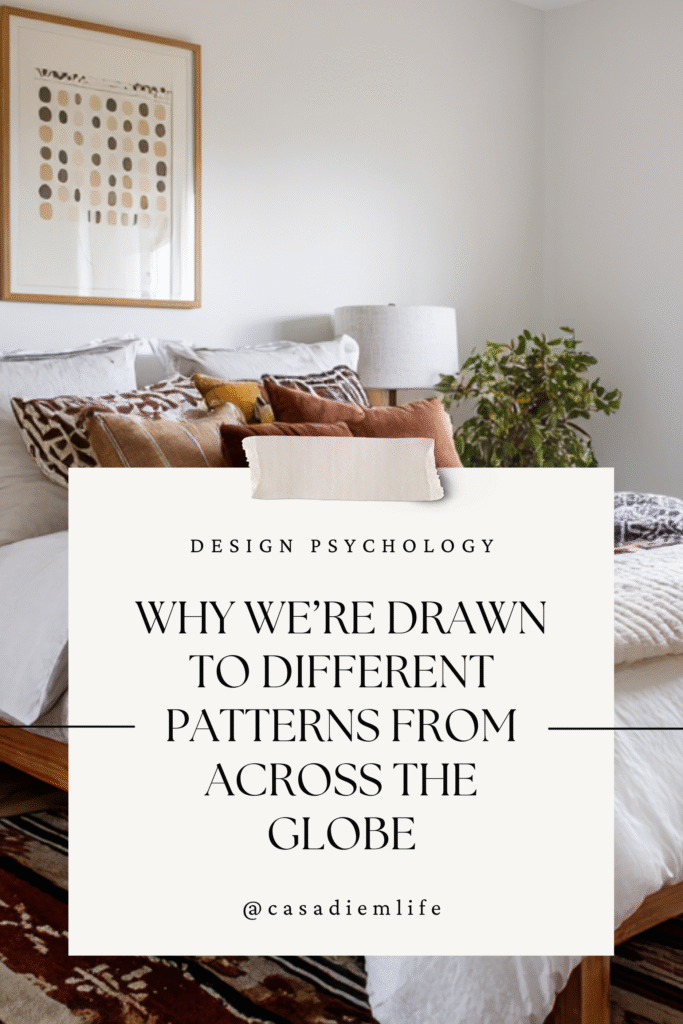
From hieroglyphs to houndstooth, decorating with patterns and prints connects us to culture, memory, and mood — and they’re a simple way to bring wanderlust home.
For many years, I struggled with what to collect on my travels — the souvenir shops were so overwhelming, impersonal, and overpriced. One day, looking back on my photos, I realized that I had been subconsciously collecting patterns for years.
I had pictures of my feet interrupting perfectly laid floor tiles; melting ice cream held up against vividly colored flags; a stranger’s clothes billowing softly against the harsh relief of carved stone; the repetition of palm shadows on a lined pavement. I could go on.
The point is: patterns anchor memories visually. They bridge the gap between what looks good and what feels good.
At home, patterns transform blank walls and neutral sofas into stories. They anchor us when life gets too digital, too sterile, too still. Prints invite personality — even in the most minimal room — and they tell the world, “someone interesting lives here.”
No Time to Read it All?
Patterns are cultural storytellers. When you decorate with global prints, you invite history, texture, and emotion into your home. Mix them with intention: choose a unifying color, vary scale, and balance bold motifs with neutrals. The result? A space that feels both curated and personal — a visual passport to the world.
The Psychology of Patterns: Why Prints Speak to Us
Long before we had words, we had patterns — dots, spirals, zigzags scratched into cave walls. The human brain loves repetition. We see patterns and instinctively search for meaning.

That’s why decorating with patterns affects how we feel as much as how our space looks.
- Repeating patterns — like a tiled floor or geometric throw — bring order and calm. Our eyes rest in the predictability.
- Organic or abstract designs awaken curiosity and imagination. They mimic nature’s irregular beauty — waves, clouds, tree bark — and spark creative thinking.
- High-contrast prints — black-and-white stripes or bold tribal motifs — energize a room. They’re the caffeine of design — vibrant, alert, full of presence.
- Low-contrast or monochrome prints create stillness. They soothe the senses, letting the texture, not the color, do the talking.
When you travel, you feel this instinct come alive — the pull toward unfamiliar textures, the fascination with local craft. Bringing that back home through pattern isn’t just aesthetic. It’s neurological. It’s grounding.
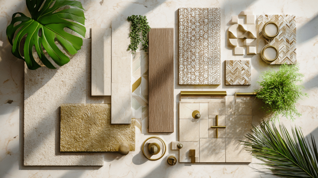
How Different Patterns Translate to Home Decor
Decorating with patterns can feel overwhelming, but understanding their emotional language makes it intuitive. Here’s a simple guide:
| Pattern Type | Mood / Effect | Design Tip |
| High-Contrast black-and-white, tribal motifs, strong stripes | Bold, dynamic, confident | Use sparingly: a rug, a pillow, or framed textile. Balance with solids to avoid visual fatigue. |
| Low-Contrast / Monochrome tone-on-tone damask, linen textures | Calm, elegant, timelines | Layer texture instead of color. Perfect for bedrooms or minimalist spaces. |
| Repeating Geometric trellis, lattice, tile motifs | Structured, classic, global | Pair with organic materials like rattan, linen, or wood for warmth. |
| Abstract / Painterly watercolor, brushstroke, marbled | Artistic, playful, spontaneous | Use as a statement piece — art prints, accent chairs, or bedding. |
| Organic / Botanical florals, leaves, waves, animal motifs | Grounding, nature-connected | Works beautifully in natural palettes — terracotta, sage, sand. |
| Cultural / Narrative Prints ikat, kilim, toile, block prints | Storytelling, expressive | Choose one focal pattern and let it guide your palette and accessories. |
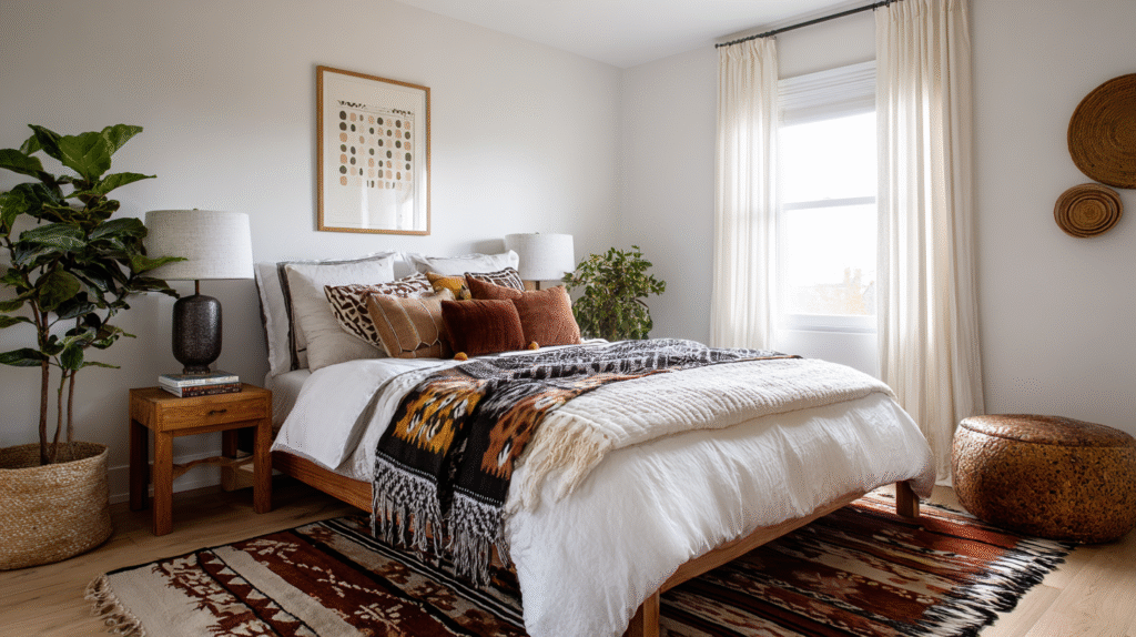
How to Combine Patterns Like a Global Curator
Mixing prints can intimidate even confident decorators, but once you understand the balance of color, scale, and mood, the process becomes joyful. Think of yourself as a curator, not a collector.
1. Start with a Neutral Base
White walls, wooden floors, or linen furniture give your patterns room to breathe. If you have a low-maintenance, calm base, you’re able to introduce more dramatic or eclectic prints.
2. Choose a Common Thread
Pick one unifying element: color, scale, or theme.
- Color: Mix prints in the same family (e.g., blues and creams).
- Scale: Combine large, medium, and small motifs.
- Theme: Link patterns by region or vibe — say, Mediterranean blues or desert neutrals.
3. Layer by Scale
Balance matters.
- Large-scale patterns (big florals, broad stripes) make bold statements.
- Medium patterns (ikat, basketweave) connect and soften transitions.
- Small patterns (herringbone, dots, mini geometrics) act as visual texture.
4. Mind the Mood
Patterns have emotional temperatures.
- Want serenity? Go tonal.
- Want energy? Introduce contrast — light and dark, geometric and organic.
5. Add Breathing Space
Solids and natural materials act as palate cleansers. Pair vibrant prints with linen throws, clay vases, or matte ceramics. To find solid color options that complement a global palette, check out Design Seeds.
6. Tell a Story, Don’t Shout It
Your goal is harmony, not chaos. Let every print earn its place by meaning — a handwoven pillow from Morocco, a framed Japanese textile, a patterned planter from Oaxaca. Each piece should whisper of somewhere.
Good pattern mixing feels like conversation — lively, balanced, and full of character.
Travel-Inspired Pattern Pairings
If you’re unsure where to start, try these globally inspired combinations to create distinct moods:
Moroccan Meets Mediterranean
Blue-and-white tiles, subtle terracotta stripes, and warm sand tones.
→ This combination is perfect for kitchens or patios.
African Modern
Mud cloth pillows, black metal accents, woven baskets, and white walls.
→ Use contrast for drama, then soften with wood tones.
Asian Serenity
Indigo shibori textiles, bamboo textures, and cream backdrops.
→ I find serenity-inspired designs ideal for bedrooms or reading nooks.
European Romance
Soft toile wallpaper, blush velvet cushions, and gold frames.
→ Done one way, this evokes cozy cafés and afternoon light. Done a different way, you’ll get Versaille-level decadence.
Each pairing feeds wanderlust without clutter. It’s not about replicating a destination — it’s about capturing its energy.
The Art of Restraint: When Less Is More
It’s easy to fall in love with prints — until your living room starts to resemble an airport bazaar. The secret to sophistication is restraint.
Ask yourself:
- Does each pattern add something new to the conversation?
- Is there enough “quiet” space for the eye to rest?
- Can one or two items tell the same story better than ten?
Editing a space is as creative as designing it. Leaving room for negative space — a blank wall, an unpatterned rug — lets each print breathe.
Curating patterns is like curating memories: you can’t display every photo, but the few you frame should speak volumes.
Quick Pattern-Mixing Checklist
- Start neutral
If your home is a work of art, always prepare your canvas before you add the magic.
- Pick one dominant print
This is your anchor – everything else you add will be centered on balancing this piece.
- Mix by scale (large + medium + small)
While uniformity is a standalone decorating style, it’s a tricky one to pull off. Start easy by mixing sizes.
- Stick to two or three colors
As a Casa Diem Life personal touch, I like to throw in an additional metalic accent.
- Include texture for depth
Imagine you’re creating a varied art gallery, not a flat photography display.
- Add solids for rest
Eyes get tired too. Solids give your eyes a place to rest when taking in a space
- Edit ruthlessly
When you’ve finished decorating a space, think very hard about one thing you can remove to make sure you’re only displaying the essentials.
The World in Every Pattern
The next time you’re tempted to buy another souvenir mug, pause and look at the patterns around you. The geometry of a handwoven basket. The faded motif on a market scarf. The swirl of a tiled café floor. These are the keepsakes that last — the ones that tell your story without words.
Your home doesn’t need to mimic the world; it just needs to remember it.
For more ideas on decorating with patterns, read my recent article on how to correctly use global textiles in your home decor.
If your favorite destination could be captured in a single print, what would it look like?
Feeling Inspired? Pin it for Later!
Want the 'how' after the inspiration?
The WanderHome newsletter is where you'll find more in-depth guides, design notes, and a few life updates to help daily life feel a little softer.
I'll send my Home Health Checklist to help you pinpoint what already works and what's quietly causing you stress in your home.

Hi, I’m Chioma — a spirited explorer and interior designer with a soft spot for a full table. I help travel-lovers bring that vacation feeling home through travel-inspired design, simple hosting rituals, and storytelling that makes daily life feel richer. Read more…

